Popout "3D" header
The concept in this article only works in IE9+ due to use of the CSS3 transform property. Without it, things won't look as nice but will still be readable/usable.
Some sites have a header / banner that appears to pop out from the page due to the visual effect of having sides which appear to stretch out to the background. Below is an example I found searching for "sites with 3D headers":
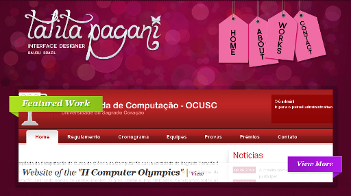 Talita Pagani / talitapagani.com
The site, at the time of capturing this screenshot, achieved this effect with images. That's easy enough, but this article wouldn't be here if that was the end of it. Images are the epitome of inflexibility. If a design changes just enough, you have to remake them. With CSS just change a few bits in the stylesheet and off you go. You can even change it on the fly in a web inspector to try out new looks.
Basics
Now on first look it appears all we need is to make a triangle that hangs down below the the element. A pseudo-element and the CSS triangle trick would give us that. Unfortunately that falls down in the face of complex coloring. Takeing a look at the previous screenshot, the triangles are in fact shaded so they appear darker on top, and lighter on bottom.
Through tricks of z-index ordering, we can actually get our flexibility by not using a CSS triangle as the base element and covering up the parts we don't want people to see. So how do we do that? In steps the skewY function of the transform property:
The skew gives the element a nice triangular like point to it, and we can apply any background, border, and other styles we wish without destroying the basic shape. When combining this with the base element, to avoid needing extra markup for our effect, this item will become a pseudo-element. Since pseudo-elements by default sit as inline text inside an element it will need to be positioned for our needs.
Live Example
This is some text
To finish the effect, we need to position it behind the parent and cover up the part we don't want to see. These styles add to those listed in the previous example block so don't forget to combine them in your own site.
Styling Finishes
From there we can add padding, shading, duplicate the effect to the other side, make it point upwards, or any number of other things.
Live Example
This is some text
This is some text
Hanging Out
To achieve the full effect in context of a parent element, it needs to hang out. This hardly needs its own section, but here it is. Hanging out is achieved by adding negative margins to the base element on ends with the pseudo-element effect. The margin should match the width of pseudo-elements and any padding on the parent.
Live Example
This is some text
Normal content.
That's it. Not a lot to it. For a complete all-in-one example of this, please see the demo page. Thank you for reading.